The rapidly evolving nature of the esports ecosystem means that the organizations and teams involved in the scene have to dance and evolve just as rapidly to keep pace. The standards expected of that esports look, after all, have grown from basement broadcasts and tech convention side events to jaw-dropping bonanzas filling Olympic-grade stadiums around the world. Even the most iconic esports teams and players have followed suite — evolving their identities in ways ranging as small as a slight wardrobe update and better overlays, to as massive as outright changing the organization’s name and culture.
Many have found greater successes than they’d dared dream of by doing so.
Many more have failed in the process.
Raising Lions
The staff at AoE Creative are no strangers to the turmoil in the esports industry — in fact, each are veterans of its many tides and trends over the years. Founder and creative director Markel Lee, and Head of Marketing Thomas Hajduk, have collective decades of experience in this industry — moreso than some of even the most successful organizations currently in play, and have key career experience in elevating some of the best-known organizations in the industry. Of the many recent brand refreshes in this most tumultuous time in the industry’s history, however, both name one organization as a particularly successful standout.
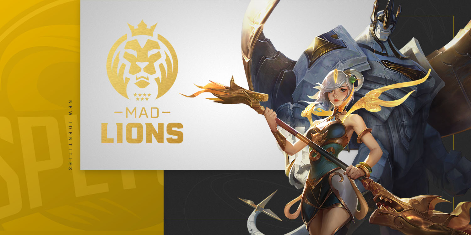
“I’d say that, in the last two years, Splyce’s rebranding into MAD Lions was really done well,” said Hajduk. The organization, a franchised part of League of Legend’s European Championship circuit, was a fairly young one, with roots as a New York organization called Follow eSports in 2015. They were later acquired by OverActive Media Group in 2019, who also owned the predominantly Counter-Strike focused Spanish organization MAD Lions eSports Club in the same year.
Combining the two into a singular identity, however, did not happen until near the end of that year, in November 2019. And in the eyes of Lee and Hajduk, this was to the greater benefit of the LEC side of OverActive’s operations.
“They realized that Splyce as a brand couldn’t grow any further as a part of the LEC, and that it needed something more than just a winning record,” explained Thomas. Though overall a successful competitor in the circuit, the same region held long-established pan-European esports titans like Fnatic and G2 — both of whom currently claim something of a duopoly for the European title, further confounding ex-Splyce’s growth efforts.
Another path, however, was uniquely open to them. “Transitioning over to traditional sports such as soccer makes a lot of sense,” said Markel. “Rebranding yourself to look similar to a soccer team is great.” But it wasn’t just adopting a more traditional aesthetic that made the difference — who they were targeting with the concept was a critical keystone. “Working with Madrid and being very focused on Spain and its locals — think that’s a very smart play for them.”
Markel had floated a similar concept while working with North American organizations, targeting a badly under-activated Hispanic demographic in North American esports, but MAD Lion’s enthusiastic pursuit dwarfed any mainline American attempts to date — and in that push, resonated strongly with a fanbase proud of their heritage and hungry for equally proud representation. “Splyce [was already] very strong in Europe,” explained Lee. “They might not have been a top team, but they were always in the conversation. Switching over to [a Spanish focus] benefited them a lot: now Spain has a team that represents them, and was competitive with the top of the top teams.”
Key to their success was a lack of superficiality, whether aesthetically or otherwise. They leaned heavily on the iconography of the Cibeles Fountain, their very names isn’t about angry large predators but a play on words to incorporate the city of Madrid, as are the seven stars of their logo, and the public involvement of head coach and veteran esports competitor Alvar “Araneae” Martín Aleñar. Yet still, fans of their old iconography are represented in the unchanged yellow theme and the focus on competitive excellence, acting as a bridge rather than severance from their New York past.
Pitfalls
For both Hajduk and Lee, the MAD Lion’s substantive approach to branding is critical — and perhaps even the entire point. The Lions’ current success mirrors their audience’s demands: a regionalization that plays upon local pride and culture, and a comprehensiveness that demonstrates thoughtfulness, goes extremely far.
In contrast, they’ve both witnessed and experienced far more shallow projects. “Something that most esports teams and most brands in general mess up on is deciding to rebrand because ‘I’m tired of seeing the same colors’ or ‘I’m tired of seeing the logos or hearing the same slogan.’” Much of the recklessness is in underestimating how critical your established image is to your served audience — and underestimating too how costly a bad impression can be.
“Tropicana lost 20% of their revenue because they made a change to their package design,” warned Lee, pointing to the company’s attempts back in 2009. In just two months, the company swapped back to their old iconography — after taking a blow worth tens of millions of dollars in lost revenue, making it one of the modern marketing era’s most costly mistakes in messaging.
Similarly, previously popular and storied North American organizations have a bad habit of switching to more generic logos, or even dropping them outright for a more featureless wordmark — costing them time and energy in supporting the new branding’s narrative when their organization’s public narrative should be supported by the new iconography instead.
But while the blatant nature of such a mistake should be obvious to most esports organizations, Hajduk identifies one error more insidious in its structure: following trends, rather than identifying untrammeled new opportunities.
One organization, in particular: “going with the hype beast direction was the right move, but just kinda stumbled on the announcement and identifying brand colors.”
In fact, aggressive streetwear aesthetics is a common theme for a lot of North American organizations now — more to their detriment than credit, as the “hype beast” aesthetic is already extremely well-established grounds for one organization in particular. “Brands just trying to just copy existing brands poorly” is the most frequent way to flop, in Hajduk’s experience.
And as Markel puts it: “if you’re trying to be more like 100 Thieves, that just makes 100 Thieves win instead of you.”