Client Case Study
OXG Esports
Breath Of Fresh Air
Project
Scope
- Brand Identity
- Logo & ID Systems
- Social Media Strategy
- Brand Style Guides
Challenge
Oxygen Esports is a well-known gaming organization rooted in several big title games such as Call of Duty League, Valorant, Rainbow Six Siege, Overwatch League, Rocket League, Halo, and others. Oxygen’s previous brand identity carried forward with its striking green and geometric stylization.
The Boston-based organization sought to refresh their brand identity with both the Call of Duty League team Boston Breach and Overwatch League team Boston Uprising joining the Oxygen Esports team. With the new teams and rosters under their umbrella, OXG required branding that reflected their new mindset and structure as they compete across multiple leagues.
The unified brand identity across all their teams would create higher readability between their teams and create a more solidified identity. Additionally, the greater sense of modernization and uniform stylization would push the brand forward in an industry that is becoming increasingly more ‘flat’.
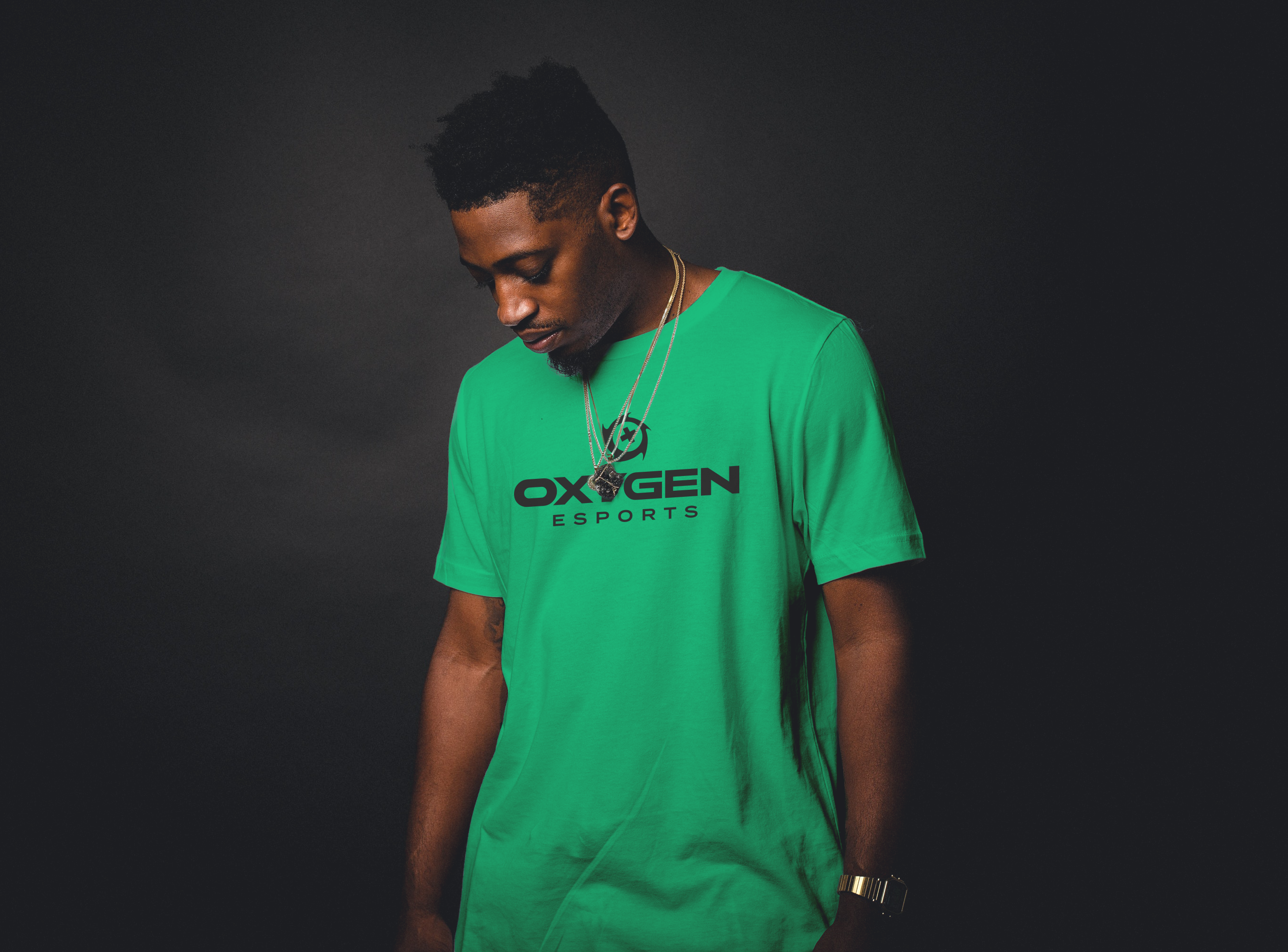
Part of their new brand design identity also meant tuning how they perceived themselves as an organization and adjusting what was first in their minds. For this, AOE Creative tuned their mindset from simply competing at the highest levels to becoming a win-first organization, the brand becomes much more energetic and a force of nature in itself. Using striking, modern colors and stylization, OXG remains approachable and unique, while retaining its highly competitive outlook.
While many of the biggest organizations in the esports industry have started with content first - 100 Thieves, FaZe Clan, and Team Solo Mid to name a few - that is not the only successful approach to developing a strong brand. Choosing to become a strong organization that creates icons rather than icons creating a strong organization is a tougher road, but may turn out more successful. A good example in a tangential scene would be, of course, the New England Patriots.
Winning first and remaining welcoming would become their bridge to creating content for their fans. Iconic influencers have joined the brand and native content continues to be produced at Oxygen. Both the Oxygen and Boston Breach social stats consistently remain at or near the top of their competing organizations month over month in terms of engagement, impressions, and overall sentiment; though it all starts with getting the team wins.
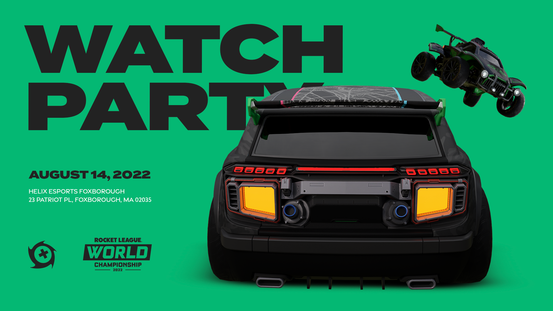
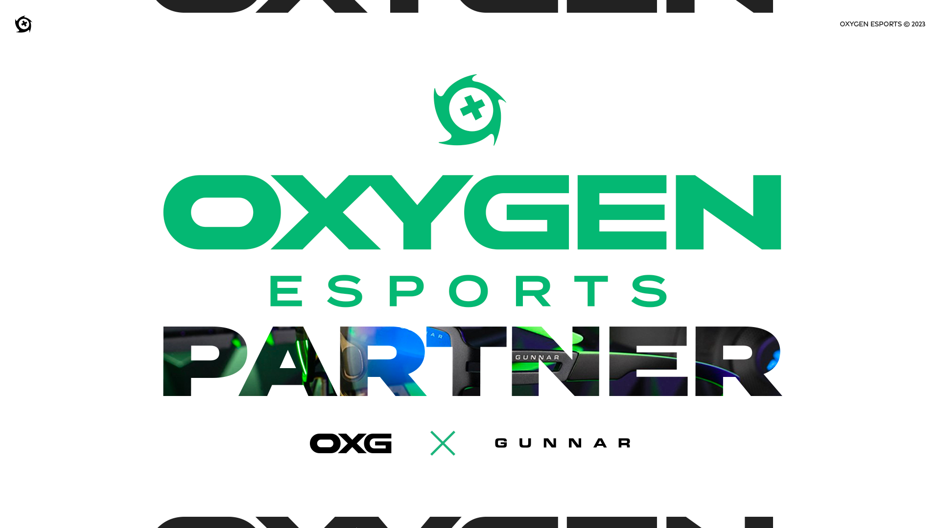
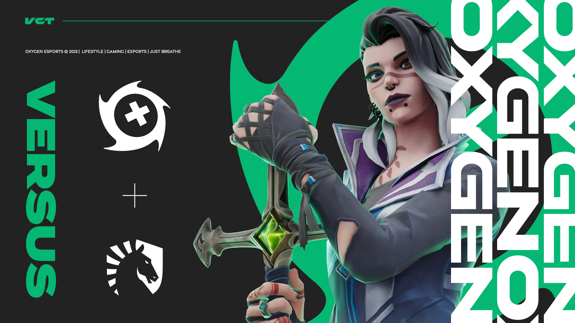
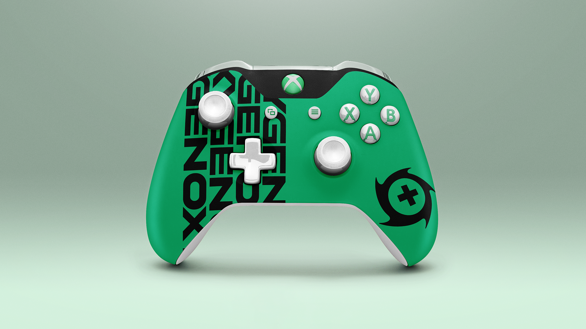
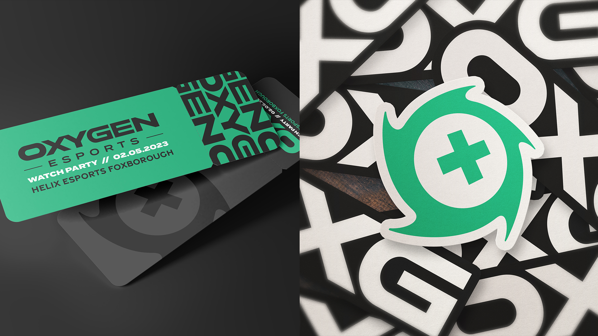
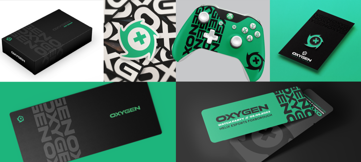
To accomplish the new brand look and feel we kept the primary logo clean, stylish and timeless. It is highly versatile keeping its strong roots and look in the emboldened wordmark. The icon ties each team within the organization together and creates a stronger connection for their community and fans to rally behind. Stylistically, the icon represents the storm that Oxygen brings to their gameplay and competition, while the inner portion may be changed for the team or game that Oxygen is currently playing in; by default we tied in Breach’s X.
Overall the look and feel was designed to be welcoming and offbeat. This does not detract from the cleaner, sleeker refresh. Though the color palette keeps the approachable attitude, putting each piece together embraces competition and slight edge to each aspect.